De Kluiverboom raises the question: “How do we deal with the legacy of post-modernism, after it has been re-written in a series of renovations?”. A building at once layered and dense, this project is a testimony to working with the intricacies of the “written page” and re-writing upon its inherent order.
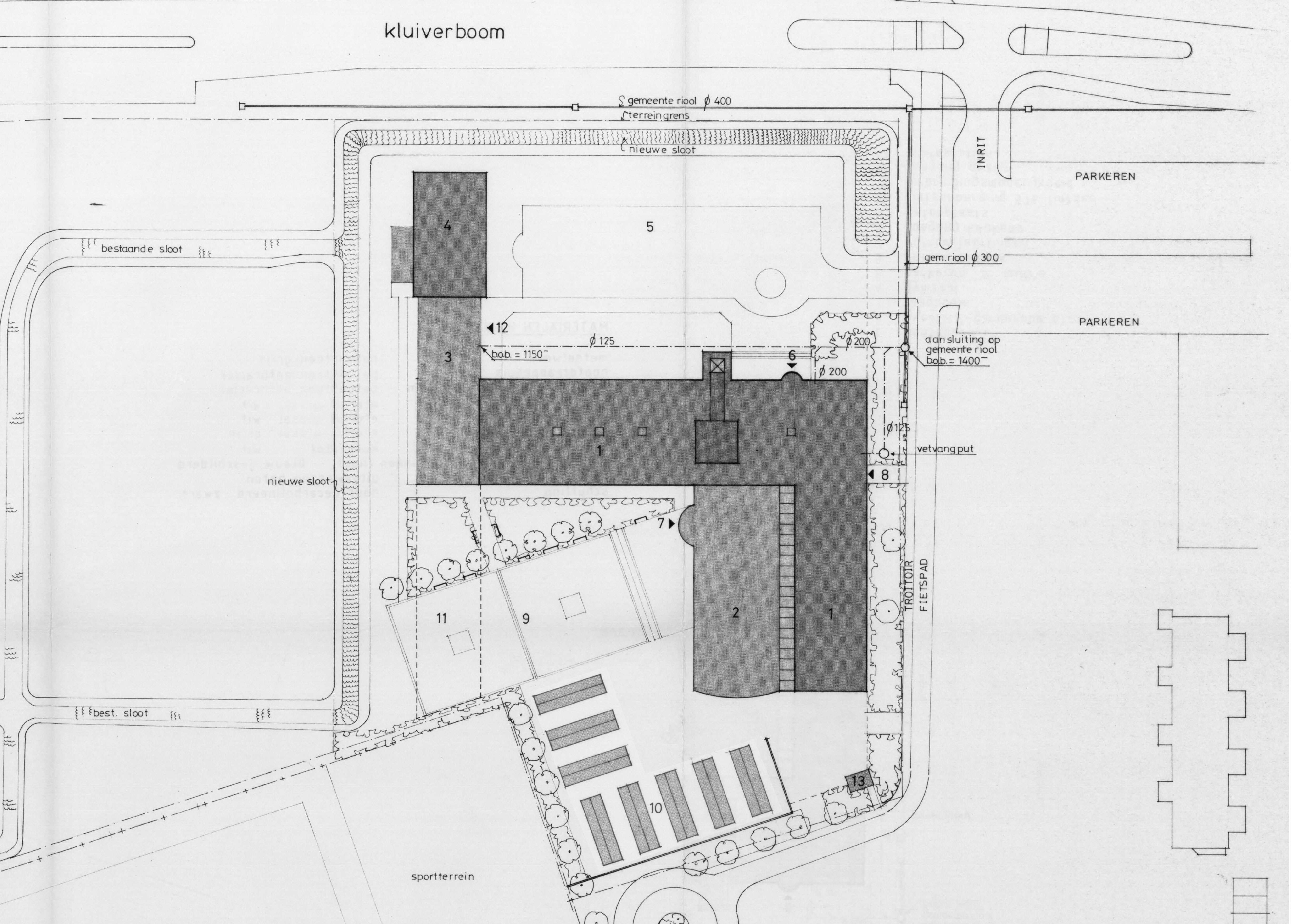
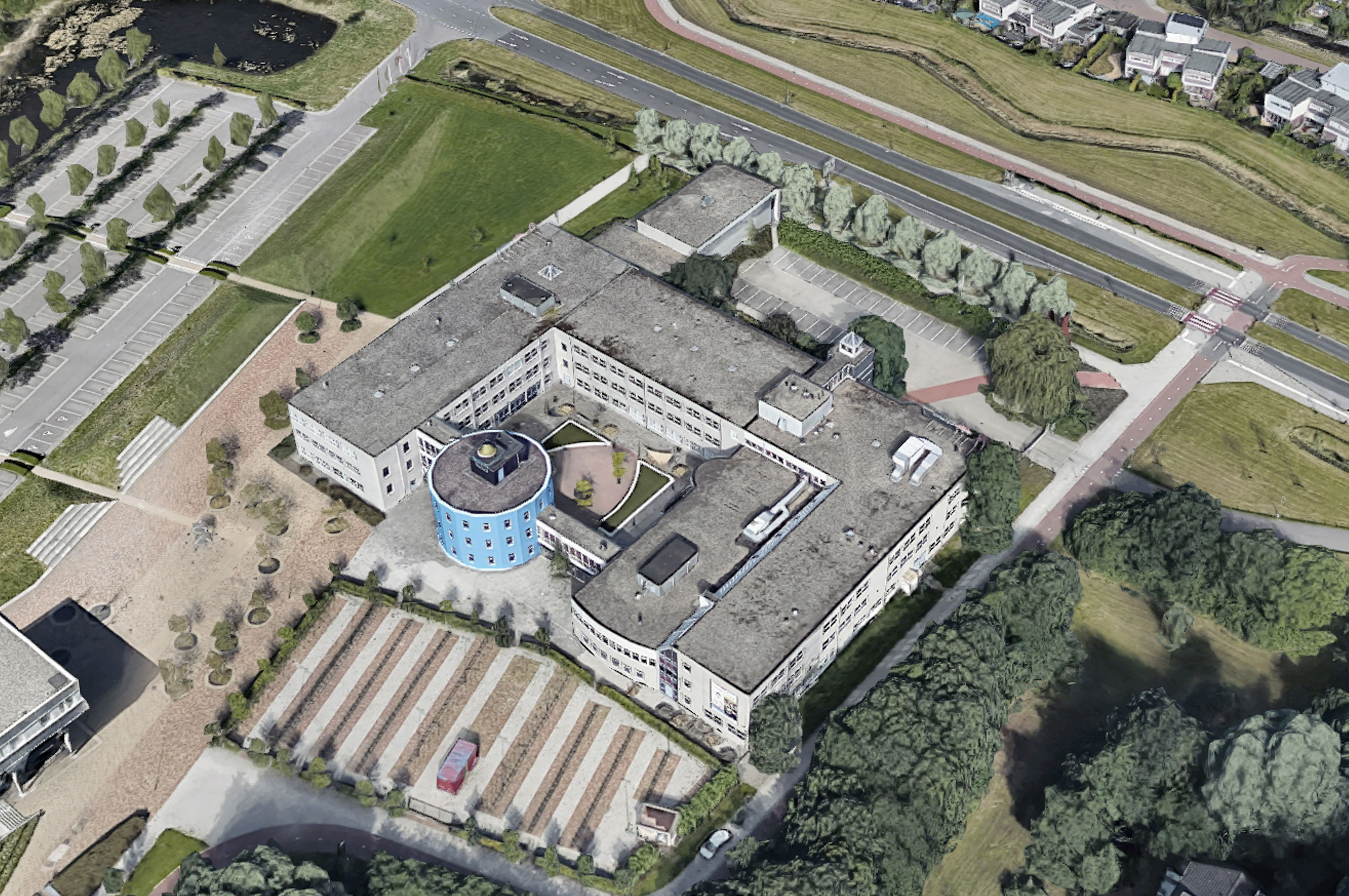
The Kluiverboom is an MBO school in Groningen (NL) established in 1989, where service providers such as hairdressers, cosmeticians and nurses learnt and practice their craft, as well as being provided general theoretical courses. The original building’s plan had a logic centred around a double height ‘Shopping square’ (Winkelplein) which functioned as a meeting ground for the students of different professions as well as visitors to the building that made use of those services.
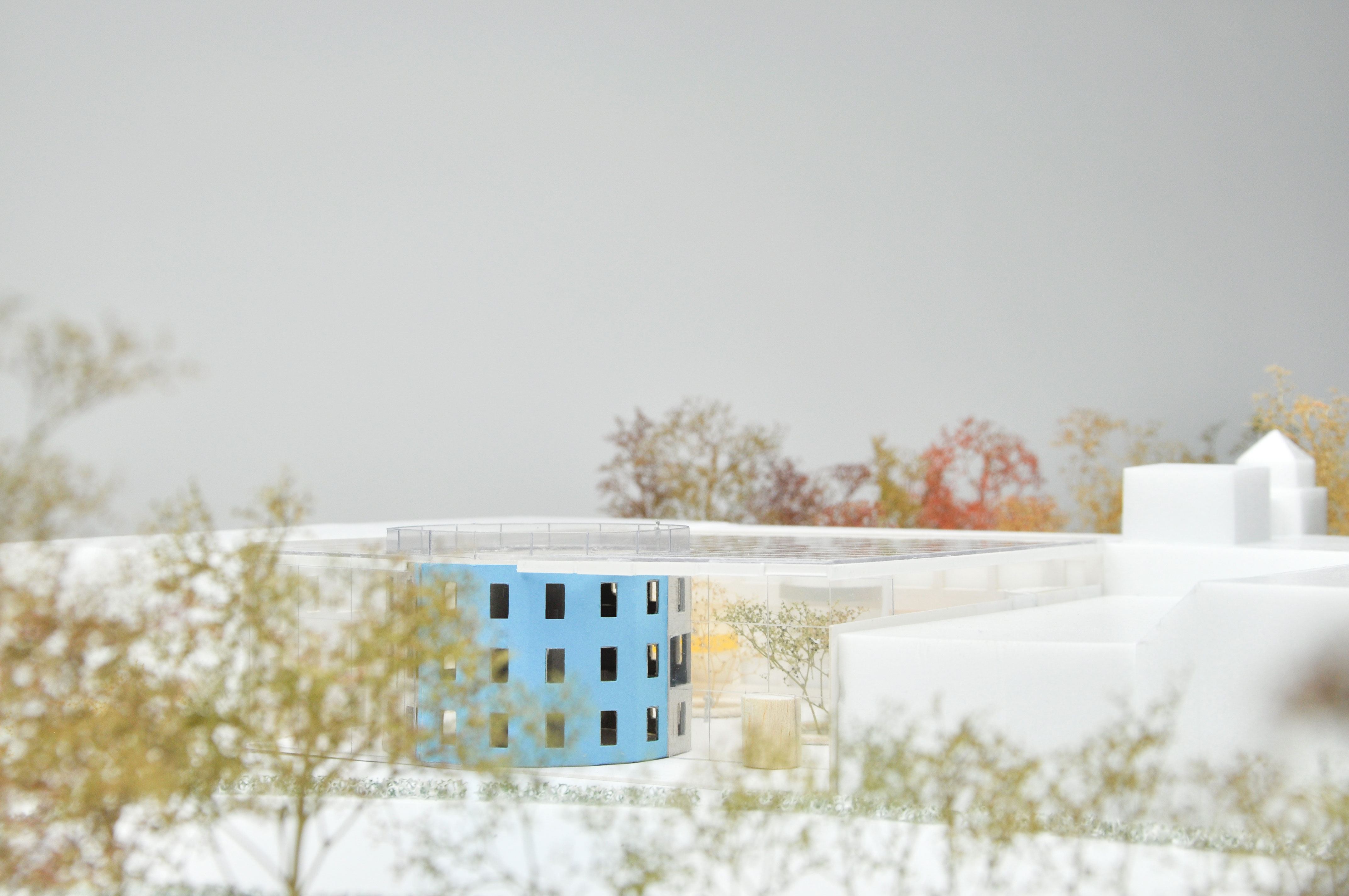
A renovation in 1996 extended the building to the West with a new wing that enclosed additional teaching halls, and to the South with a postmodern extruded cylinder enclosing a mediatheque. The new plan replaced the main entrance of the building, thus removing the direct axis that linked it to the ‘Shopping square’ of the building. Supporting functions replaced the practice rooms around the former ‘Shopping square’, the void above the square was closed and the original logic of the building was re-shuffled. The current plan is centered around the new courtyard, which is disconnected from the main entrance. As a result, most students often enter the building via the secondary entrance to the South, creating a confusing arrangement.
HOH was appointed by Mevrouw Meijer and the Kluiverboom to propose a new spatial plan aimed at maximizing the use of existing space through a functional and social reorganization and to find additional space to allow for the present and future growth of the school.
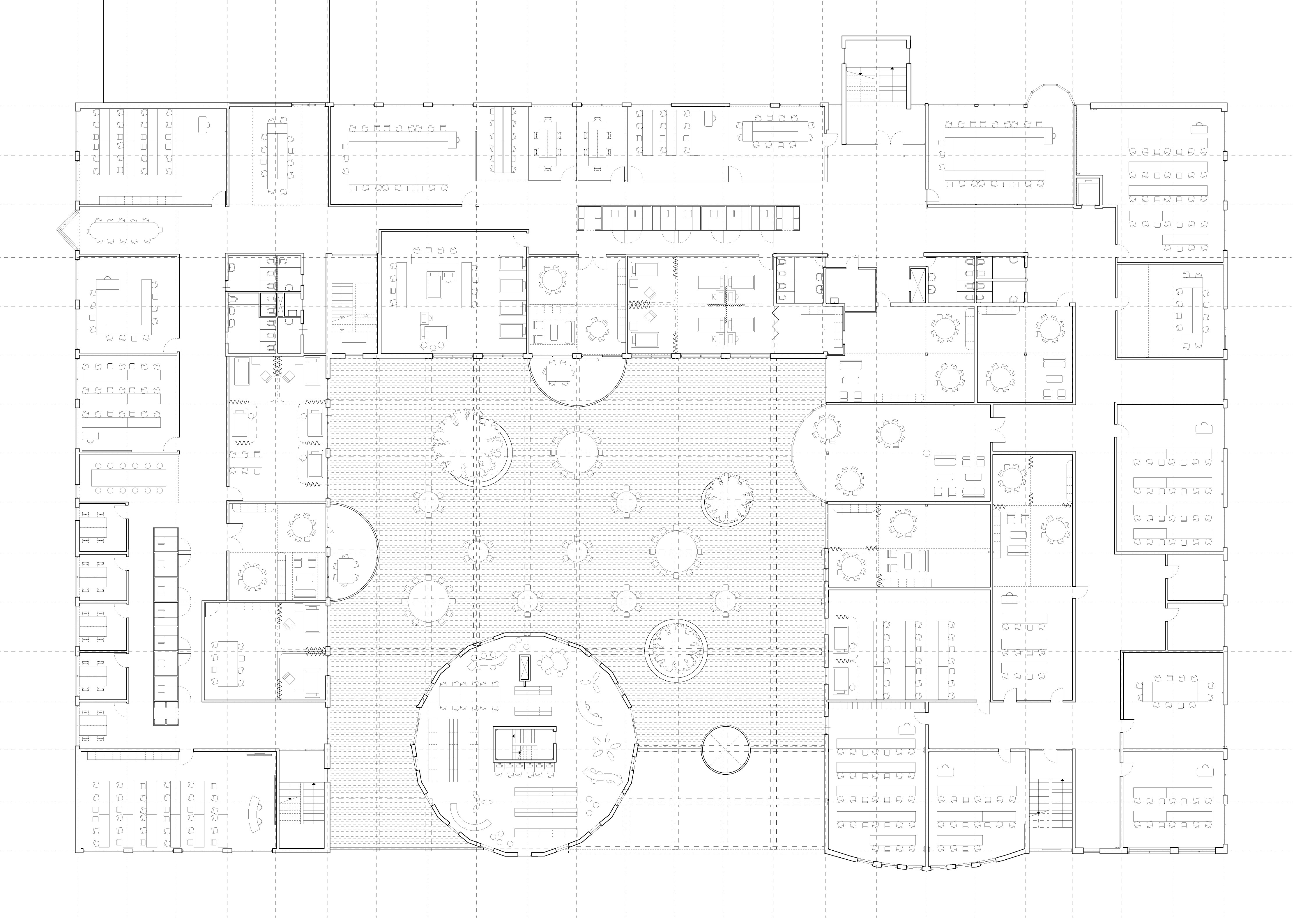
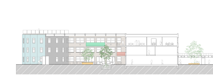
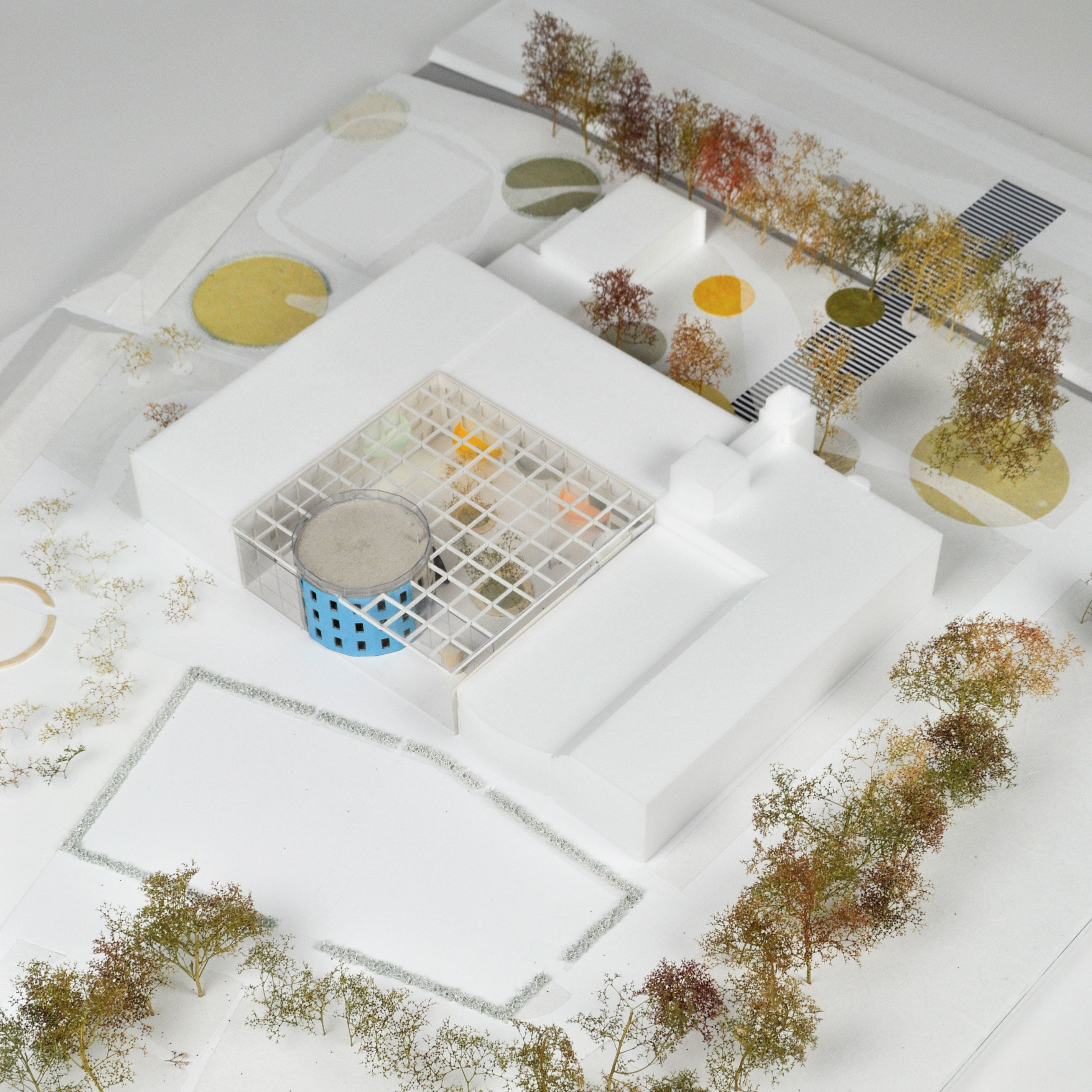
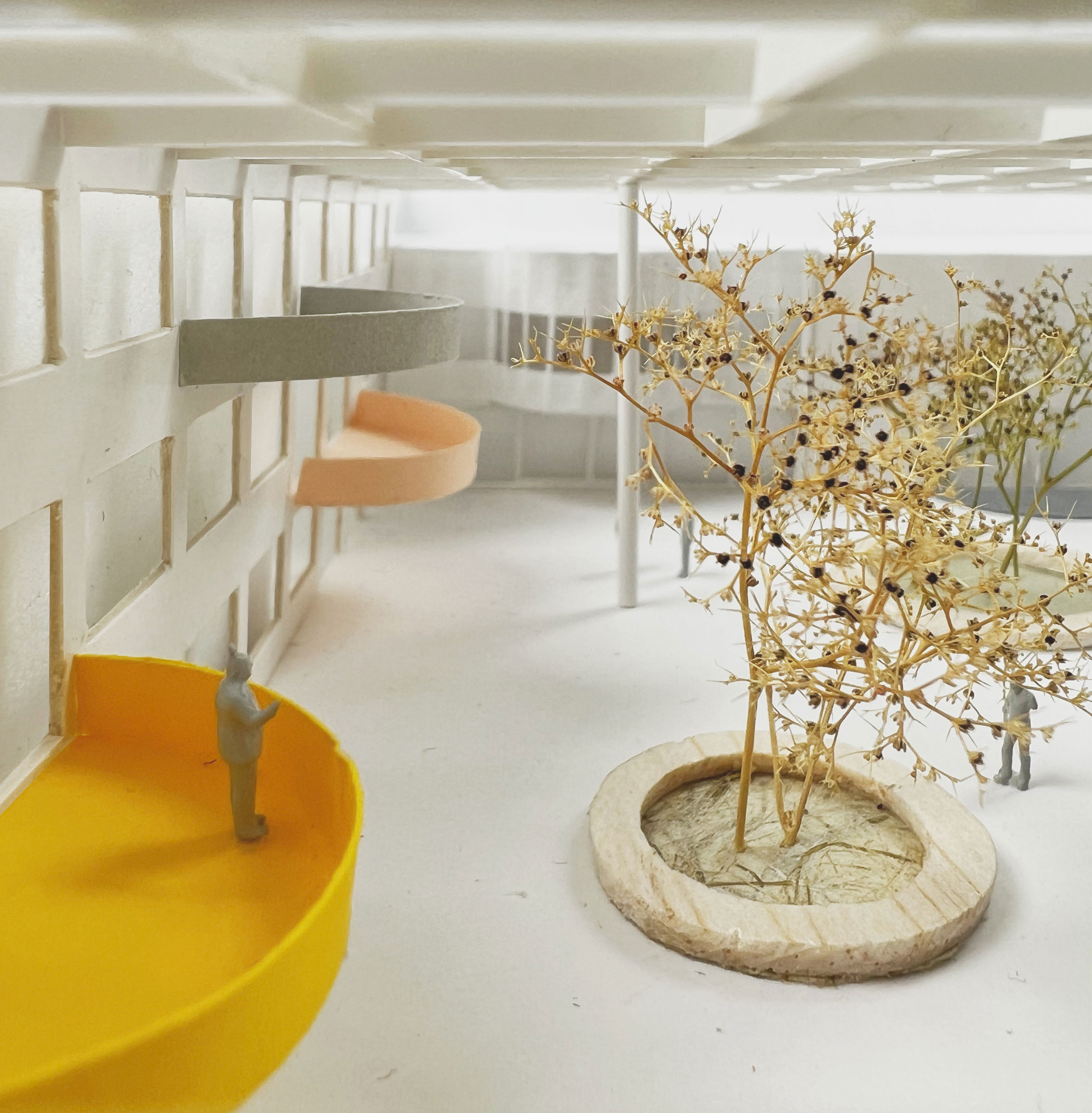
The new spatial plan focuses on enhancing the courtyard of the building as a meeting ground between the various users, turning it into the new heart of the building. The space is covered by a canopy and renovated in a style that responds in a playful manner to the postmodern mediatheque tower. Colorful semi-circular balconies project into the new courtyard, creating more space, vistas and a continuation of the social interaction between departments and between students and teachers.
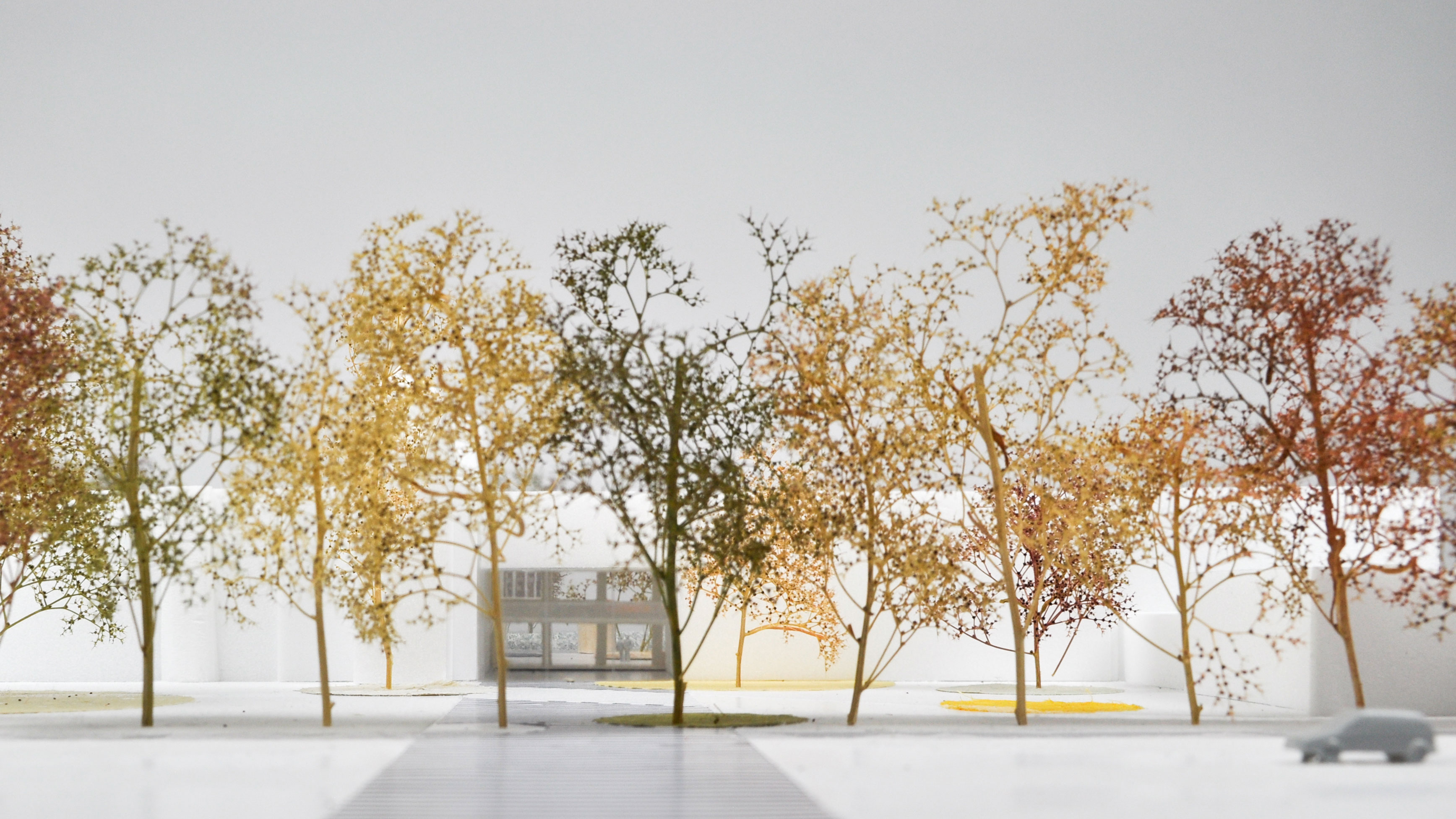
The proposal also re-locates the bus stop to the North of the building, creating a direct visual and functional relation between the entrance of the building and the courtyard. To mark the entrance of the building, the currently dull hard-landscaped area surrounding the entrance is renovated into a new public square, where greenery which will improve water-resilience and biodiversity of the public space is introduced in circular pockets that mirror the playful design of the new covered courtyard.
Moreover, the new plan proposes a functional re-allocation, placing the practice rooms around the new internal courtyard, with the theoretical classrooms placed in the outer ring of the building, towards the Northern and Western facades. Thus, the community aspect of the building is enhanced, encouraging spontaneous meetings between students of different practices in the new heart of the building.
Location : Groningen, the Netherlands
Client: Mevrouw Meijer
Program : Secondary vocational education
Status: Concept Proposal
Project team: Freyke Hartemink, Jarrik Ouburg, Pedro Magalhaes, Enrica Pesce

